Create Your Own Realistic View Stamp
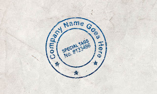
In this lesson I will show you how to create your own realistic stamp, which you may use further in your design.
First of all, we need to create a new document with the size of canvas 500×300 pixels, white background. Then we need to find some texture for the paper. We can do this by searching via Google Images. Open it and locate at the canvas as you may see on the picture bellow:
First of all, we need to create a new document with the size of canvas 500×300 pixels, white background. Then we need to find some texture for the paper. We can do this by searching via Google Images. Open it and locate at the canvas as you may see on the picture bellow:

Go to the next step, I mean start creating stamp ingenuously. Remember, firstly we need to make stamp in scale 20% larger than original size, further we shall decrease it to get more realistic lay out. Firstly, create a frame and stamp within it. Use the Ellipse Tool and create round shape with any colour. It does not meter which colour you will use.
Set up fill opacity to 0% and apply the Stroke layer style to this layer:
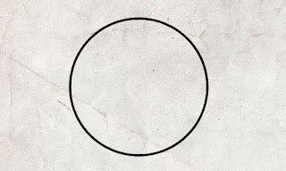
After this we duplicate the layer and make it a little smaller, on this time press and hold Alt+Shift to get the proportional decreasing.
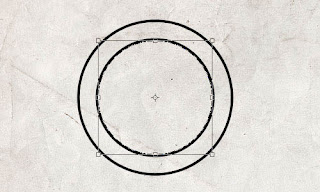
In next stage you need to type text across the circle line. Use the Horizontal Type Tool to type some text, move cursor perpendicularly to circle’s line and when it will take a look like on picture below start to type the text.
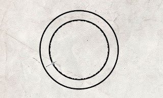
Type the text ‘Company Name Goes Here.’ The font we are using is Arial – standard free font from the Windows’ font library.
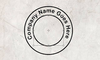
Now, I suppose we need to fill the free space between 2 circles. Use the Custom Shape Tool and choose the form that you may see bellow from the standard Photoshop palette:
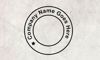
Copy this star two more times with Ctrl+J and move it a little bit left to get the result as bellow:
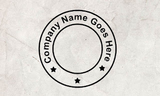
Finally, we need to add text within the little circle. Use the Horizontal Type Tool and type some text within it. I used the Arial Narrow font.
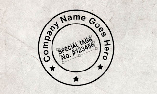
We have finished design for our stamp. Now, we need to make it stylish to give it realistic view. Merge all layers except background in one and apply the Gradient Overlay layer style to received layer.
Then create a new layer over and merge it with the previous one to get all effects in one layer. Then use the Eraser Tool (Mode: Pencil, Brush size: 1 px) and erase chaotically as you can see at the picture bellow:
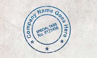
After this set up the mode layer to Dissolve, then create a new layer over and merge it with the previous one.
